Juice House App
Introduction
So when I was looking at the app, I noticed something in the calendar page that could be a bit clearer. It was hard to find what day the user is in for that month of the calendar, and when the user taps on a current day, the dot indicators blend too well with the color when the user selects a date.
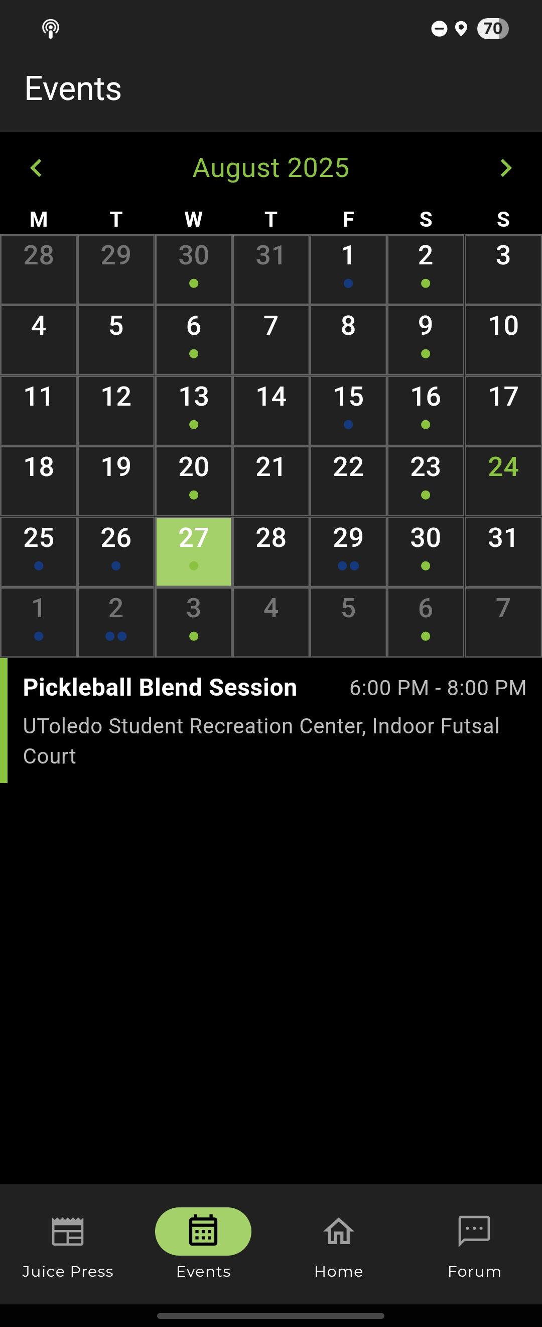
So in that image, the cell filled with green is the selected date. And if you look closely, there is a dot that represents that there is an event going on. And the text in green (look at the 24th in the calendar) in the calendar tells that is the current date.
I did not have much experience with UI/UX back then (this was March 2025) so what I did was look at huge companies on how they designed the UI interface for calendars. I took note on how they did it and talked with the owner about the practicality of the feature. And he thought it was a good idea, so I dove in into the code.
The big challenge for me is that I have not experienced how to contribute with such a big codebase. So what I did was, use the find feature to locate where the calendar feature was implemented (though in this day and age I could have just asked Copilot to help me locate the calendar feature). And since I just got started with using Flutter (the app was using Flutter) I used Copilot to explain how the code works so I can figure out how to implement this correctly.
The cool part was that I had a Samsung Galaxy Tablet and I was using my tablet to connect to the app I was currently developing. So to make sure I understood the code, I tweaked some values in the code and saw what changed in the app. From there, I then used the find feature to locate what variable they used for the calendar colors.
I found the calendar implementation and then tweaked different values to see how it changes the aspects of the color of the calendar. Through just small tweaks in the ternary operator statements, I managed to get the feature to work.
I was happy with how the end result turned out and it felt like an accomplishment. Here is the tweaked image.
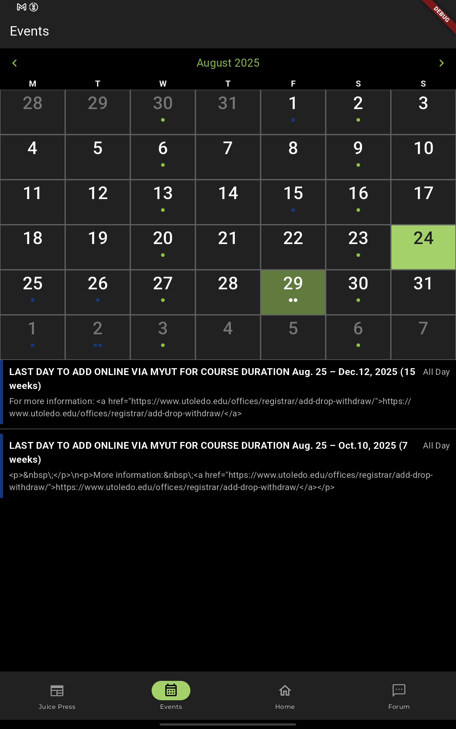
In the calendar, instead of the text being green for todays date, the cell background color is green. And when the user wants to check on a date, the selected date will have a cell that is green, but more transparent. The dots are more visible by making them white; the color coding does not really matter in the case since the color types of the events are shown below in a list. And in the case where the user selects todays date, the bright green color will override the transparent green color.